Your nonprofit website is one of your organization’s most important assets for raising awareness for its cause and marketing its services and campaigns.
If your site isn’t performing well or you think its design or functionality could be improved, you owe it to those you serve to make some thoughtful updates.
A full-blown nonprofit website design project (as well as smaller, iterative updates) are important investments for nonprofits, and they can involve any number of different strategies and techniques.
To help you get inspired, we’ve created this guide. We’ll cover:
If your organization’s website needs a total overhaul, you may feel overwhelmed and unsure where to begin. After all, your day-to-day nonprofit work probably doesn’t involve much web designing or development. Luckily, there are experienced nonprofit web design consultants who are ready to help you create a strong website that incorporates all of today’s best practices. Let’s get started!

15+ Nonprofit Websites to Explore
- Interlochen Center for the Arts
- charity: water
- North Shore Animal League
- Mustard Seed Communities
- Mary M. Gooley Hemophilia Center
- Project Open Hand
- Darien Nature Center
- Save the Children
- Ronald McDonald House Charities
- Ontario SPCA and Humane Society
- Better Buying
- Lupus Research Alliance
- National Partnership for Women & Families
- American Cancer Society
- iThrive Games
- Tree House Humane Society
- Brooklyn Conservatory of Music
- North Carolina Center for Nonprofits
1. Interlochen Center for the Arts
Nonprofit Website Overview
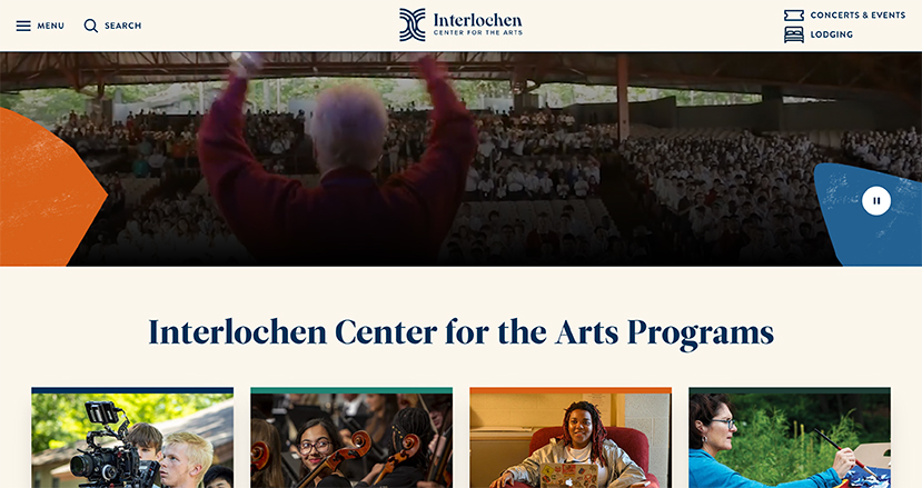
Interlochen Center for the Arts (ICA) is a nonprofit educational institution dedicated to empowering students from all around the world through high-quality arts and cultural programs.
The ICA website does an excellent job of promoting the organization’s mission, educating the public about its various programs, and sharing information about events. In addition to being full of great information, the site also has a clean, modern, and inviting look.
Why This Website Stands Out
In addition to useful information and a great visual design, what takes ICA’s website to the next level is its functionality, including the following features:
- Responsiveness. The ICA website looks amazing on the big screen, but its pages’ full-width layout and high-quality video loops still work just as well on tablets and mobile devices. Even better, the top navigation bar and other dropdown menus throughout the site shrink down to an appropriate size and are easy to tap on a touchscreen.
- Easy-to-use donation form. ICA’s donation form is informative and simple to fill out. It gives context for what donations to the Interlochen Annual Fund and Interlochen Public Radio do, and it also provides answers to a variety of FAQs in a convenient drop-down menu. The donation form itself is succinct, offers users the chance to turn a one-time gift into a monthly contribution, and includes a matching gift tool that empowers donors to see whether their employer offers matching gifts.
- Program search tool. ICA offers programs in several areas, from creative writing and music to dance and theatre. With so many options available, the organization recognizes that it can be difficult for community members to choose how to get involved in the arts. The website includes a handy search tool that allows users to select their area of interest and age range to explore relevant programs and courses.
Key Takeaway
A stylish and unified design plus seamless functionality creates an amazing impression on donors and visitors alike. Make sure your nonprofit’s website offers an excellent user experience and that all of its features work well on multiple devices.
2. charity: water
Nonprofit Website Overview
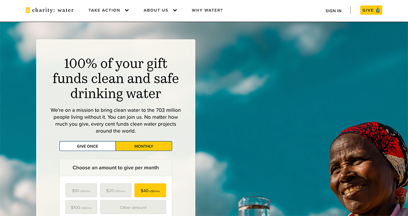
charity: water‘s mission is simple but highly impactful: to bring clean, safe water to people around the world.
This nonprofit website has a simple, clean, and professional look and puts a human face on the issues of water access and water quality. It’s designed to drive support from the get-go, with a prominent donation form presented front and center on the homepage. The site also does a great job of quickly educating people about the global water crisis and inspiring them to get involved.
Why This Website Stands Out
There are several elements that make charity: water’s website an effective resource for learning about its mission and taking action. Here are a few things we admire about the site:
- Inspiring imagery: Across the website, charity: water uses high-quality images of the people they serve accessing fresh water. This ensures that no matter where a website visitor is on the site, the focus is on the organization’s beneficiaries.
- Impact information: The charity: water homepage provides an overview of the organization’s impact, listing how many water projects have been funded to date, the number of countries they’ve served, and the number of people who will be served as a result of their projects. This information illustrates for visitors what their contributions go toward and inspires more support.
- Transparency: Part of running a successful nonprofit is building trust and credibility with your audience, and your website can help you with that. charity: water does this by explaining how their donations are used, providing details about their completed projects, and encouraging visitors to look at the organization’s financial statements.
Key Takeaway
Your website visitors need to know what your nonprofit’s priorities are and perceive your organization as trustworthy in order to feel good about supporting you. Like charity: water, your nonprofit should use its website to focus on the community it serves and provide information about its operations that instills confidence in your supporters.
3. North Shore Animal League
Nonprofit Website Overview
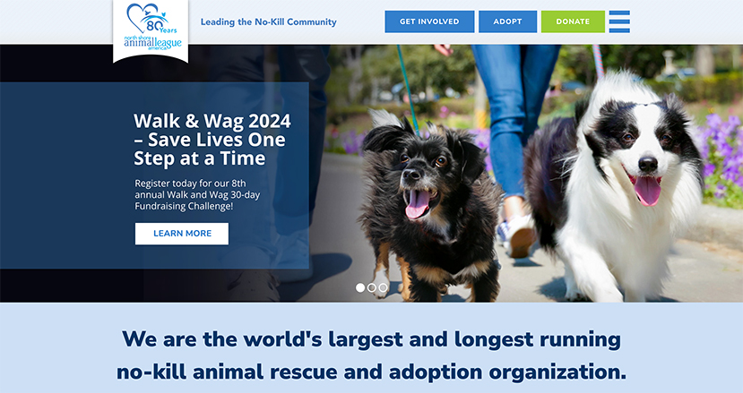
The world’s largest no-kill shelter, North Shore Animal League uses their site to promote animal adoptions as well as donations and volunteer sign-ups. With so many ways to get involved, it’s important that the Animal League clearly directs visitors to take a specific next step on their website. And from the moment you land on their homepage, you’re prompted to do just that on their top navigation bar!
It’s not exactly difficult to make adorable dogs and cats appealing, but the North Shore Animal League exceeded all expectations on their inviting homepage as well as throughout the rest of their site.
Plus, the North Shore Animal League puts their cause at the center of their site by packing their site with adoptable pets. (And who could say no to their faces?)
Why This Website Stands Out
In addition to adoptions, the North Shore Animal League clearly prioritizes donations to help further their cause. The Animal League website streamlines the donation process and ensures supporters follow through with their gifts by including:
- Cohesive branding. Donors need to trust that their gift is going to the right place, and consistent branding across your website and on your donation page can reinforce that. The North Shore Animal League included its logo, color scheme, and a brief reiteration of its nonprofit’s mission statement.
- Recommended giving levels. The Animal League’s donation form simplifies giving by highlighting a recommended giving amount ($60), as well as additional giving levels. Not only does this make donating even quicker, but it also may encourage a supporter to give just a little bit more than they were planning to.
- Recurring gift option. Online giving software makes donating every month easier than ever. By simply ticking a checkbox, a donor can sign up to have their gift repeat every month, skyrocketing their impact! The North Shore Animal League places this option in an easy-to-spot location on its form so that no donor can miss it.
In addition to encouraging donations, the North Shore Animal League also enables supporters to raise money on the organization’s behalf through an integrated Blackbaud peer-to-peer fundraising tool, which the team configured with help from Team DNL. Check out their DIY-style peer-to-peer options for birthdays, weddings, marathons, and memorials.
Key Takeaway
Giving your visitors specific next steps to take is just as important (if not more important) than illustrating your mission and work. Supporters need multiple ways to get involved, and your site should make it clear and easy to get started with a donation, volunteer application, fundraising page setup, or other mission-specific way to engage.
4. Mustard Seed Communities
Nonprofit Website Overview
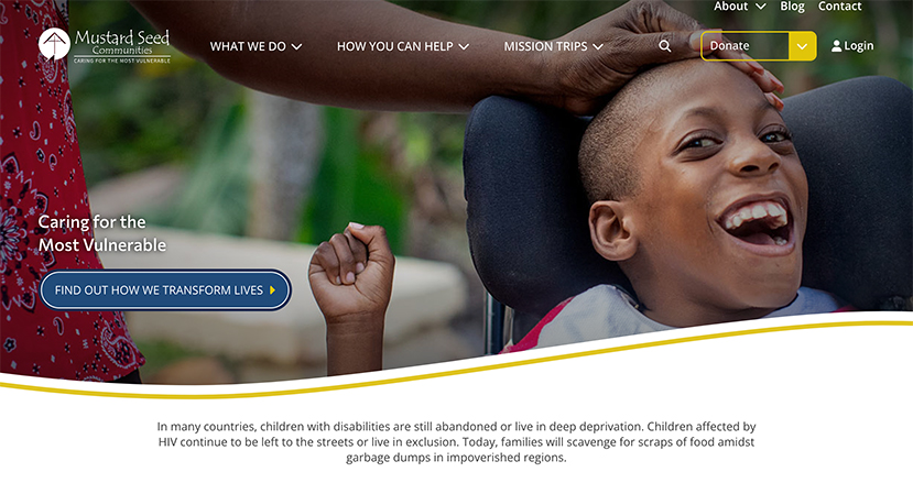
Since 1978, Mustard Seed Communities has cared for vulnerable populations worldwide. By organizing mission trips, launching residential care programs, and hosting educational programs in developing communities, Mustard Seed strives to equip individuals with the skills they need to be self-sustaining, healthy, and happy.
On every page of the Mustard Seed website, you’ll quickly see just how much of an impact this organization has! And by putting their work front and center, the organization shows their site visitors what is most important—the communities they serve!
Why This Website Stands Out
Some ways Mustard Seed promotes its mission throughout every inch of the site include:
- High-quality photos across the site. Mustard Seed has a lot of success to show off, but they manage to do so without overwhelming visitors. Carefully-chosen photos across the site make their web pages pop and showcase various efforts.
- Mission page. Every nonprofit website should prominently include the organization’s mission statement, and Mustard Seed’s Mission and Vision page does a great job of articulating their purpose using short paragraphs and to-the-point language.
- Meet the People of Mustard Seed Communities page. In addition to their mission statement, Mustard Seed also created a dedicated page to showcase the individuals they’re helping every day. This page allows potential donors to put a face to the cause they’re supporting and connects them to Mustard Seed in a personal way!
Key Takeaway
Your nonprofit’s website should actively highlight your work’s impact. After all, your good work is the primary motivating factor for new donors! Mustard Seed’s Meet the People of Mustard Seed Communities page is a great example of the level of detail you should dedicate to illustrating impact through your site.
5. Mary M. Gooley Hemophilia Center
Nonprofit Website Overview
The Mary M. Gooley Hemophilia Center is a leading nonprofit treatment facility for rare blood disorders, including hemophilia, von Willebrand disease, and others.
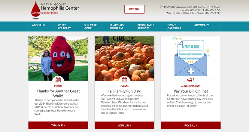
Because the Center’s site targets a number of audiences, including patients, donors, and individuals seeking more information about these diseases, it’s important that their website serves a range of purposes. The Center does a fantastic job of streamlining their content and presenting it in an engaging, informative, and inviting way, right from the homepage.
Why This Website Stands Out
The Mary M. Gooley Hemophilia Center accomplishes a lot through its site—here are just a few of its star web design features:
- Prominent donation button. The Center takes donation buttons to the next level by placing a free-floating button on the side of every page. The easy-to-spot red button scrolls with the visitor, so no matter where they are on the site, they can always take that next step.
- Navigation. For a site with so much content, the Center has maintained strong organization via their comprehensive (yet clear) top navbar. No matter what a visitor is looking for on this nonprofit website, they’ll be able to locate it easily.
- Educational materials. Providing patients and their loved ones with resources related to hemophilia and other disorders is a major priority for the Center, so they’ve created several well-organized educational pages under the What We Treat navigation tab.
Key Takeaway
Websites that need to cater to multiple audiences don’t have to sacrifice their value as a donation or engagement tool. Prominently feature your donation button on your site’s header on every page, or work with a tech expert to configure more advanced responsive settings like this site’s donation button.
6. Project Open Hand
Nonprofit Website Overview
Project Open Hand is a nonprofit that provides “meals with love” to senior citizens and individuals suffering from critical illnesses. Its mission is to nourish the most in-need members of the community through the best medicine there is—healthy food! The organization provides 2,500 meals and 200 bags of groceries for clients in the San Francisco and Oakland area every day.
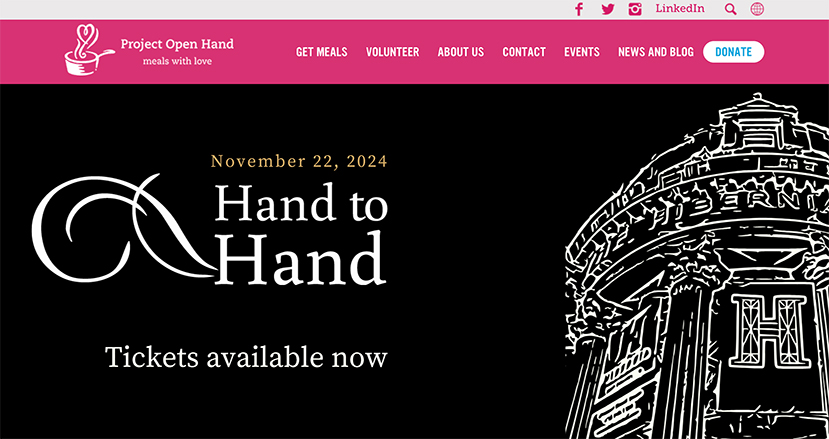
In addition to donations, Project Open Hand thrives on the generous support of volunteers. Its site clearly reinforces the organization’s constant need for a helping hand through its bold branding.
Why This Website Stands Out
From just one look, you can see how Project Open Hand’s site engages its audience, but some of the specifics include:
- Strong calls to action. As you can see from the homepage, Project Open Hand immediately calls site visitors to take the next step by either becoming a client, volunteering, or making a donation. Because the buttons are so bright and in the center of the landing page, no visitor can miss them.
- News and blog content. Nonprofits need to keep their sites frequently updated to show their visitors that they’re actively serving their communities. Project Open Hand accomplishes that and goes a step further by organizing its news, blog, and press releases in an eye-catching (on-theme!) manner.
- Social media integration. This site encourages visitors to connect on other platforms by placing quick links to the organization’s Facebook and X page in their navigation bar. Even better, they have a real-time Facebook feed widget on every page.
Key Takeaway
Use your site to foster an engaging sense of community for your supporters. Project Open Hand’s emphasis on volunteering information, video interviews, blog content, and social media feeds are great examples that you can implement into your own site.
7. Darien Nature Center
Nonprofit Website Overview
Located in Darien, Connecticut, the Darien Nature Center is a nonprofit educational organization providing community programs for animal and nature lovers of all ages.
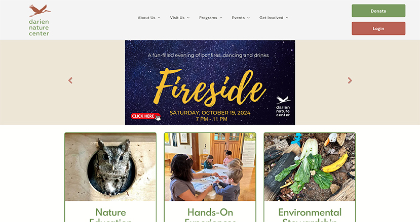
With seasonal exhibits, summer camps, and daily classes and programs featuring a diverse array of live animals, Darien Nature Center is a vibrant part of the local community, and its website illustrates that perfectly!
Why This Website Stands Out
Darien Nature Center’s site has a goal unique to cultural organizations—to inspire visitors to close their laptops and come out for a visit! To promote their programs (and perhaps a donation or two!), Darien Nature Center has built out a site that follows nonprofit web design best practices, including:
- Minimalistic design. As you can see on the site’s Our Animals page, Darien Nature Center follows a simple, straightforward design strategy. There is plenty of white space, drawing the visitor’s eye to the high-quality photos and text instead of busy background elements.
- User-friendly calendar. Since Darien Nature Center hosts so many programs every day, it’s important that its website houses all event details in one centralized place. The calendar is easy to find, view, and interact with.
- Branded event registration forms. Darien Nature Center has designed web forms that fully match its brand. Plus, the forms only require the most important details from registrants, so anyone who wants to sign up for an event can do so in as little time as possible!
Key Takeaway
Darien Nature Center’s website is a great example of the value of keeping it simple. A streamlined, tidy design almost always looks (and works) better than an unnecessarily busy one.
8. Save the Children
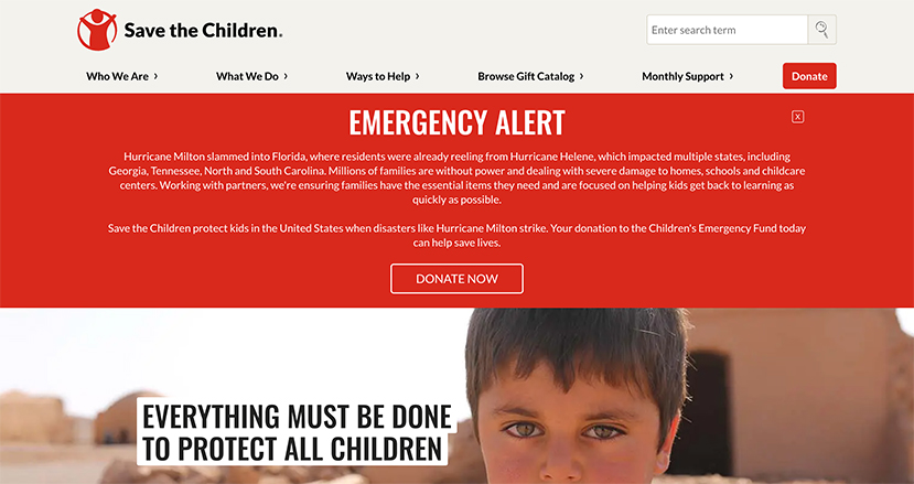
Nonprofit Website Overview
Save the Children is a leading charity dedicated to improving the lives of underprivileged children around the world.
The main ways that donors can support the organization are by donating, sponsoring a child, or purchasing a gift (such as a blanket or goat) to be sent to a child in need. This is an extremely effective and popular way to pursue charitable missions, but it creates some logistical challenges. However, the organization’s website is built to address those challenges head on.
Why This Website Stands Out
Save the Children’s website does an amazing job of handling complex tasks while staying organized and easy-to-use. Highlights include:
- Luminate Online integration. Thanks to a custom integration with Luminate Online, this site supports complex sponsorship search and eCommerce tasks while reporting all-important engagement data directly to the organization’s central database.
- Comprehensive content. This site includes plenty of content on current issues around the world as well as pages outlining Save the Children’s impact. Most importantly, everything is organized in an intuitive way that’s clearly labeled and doesn’t get in the way of the core purpose of securing new donors.
- Streamlined eCommerce features. Selling anything online is a somewhat complex process that requires careful data logistics. Save the Children’s gift catalog is a great example of an effective, organized, and streamlined eCommerce section that makes it easy to give.
Key Takeaway
For advanced logistical tasks, developing a custom integration between your database (or other) software and your website can have major benefits for your overall digital strategy. Team DNL worked with Save the Children to create their customized online child sponsorship experience, and we’re proud of the result!
9. Ronald McDonald House Charities
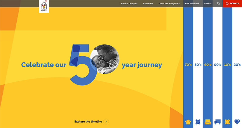
Nonprofit Website Overview
For the past 50 years, Ronald McDonald House Charities (RMHC) has provided support to families with children who are sick or injured and need to travel to receive medical care. The organization offers several programs, including its Ronald McDonald Houses program which offers home-like facilities where families can stay while their child is in the hospital, and Ronald McDonald Family Rooms, which create safe and peaceful spaces in hospitals where families can relax together.
RMHC’s website is built to educate the public about its mission, encourage donations, and empower families to access the organization’s services. It does all of this effectively while offering a seamless user experience and professional and consistent branding.
Why This Nonprofit Website Stands Out
The RMHC website is effective because it leans into several nonprofit web design best practices. Here are a few specific things we like:
- Multiple giving options: On their Get Involved page, RMHC provides information about ways visitors can get involved in the organization’s mission besides giving a monetary donation. Different options like giving a legacy gift, fulfilling a wishlist, hosting a fundraiser, or becoming a corporate partner are explained clearly.
- Easy-to-use Find a Chapter tool: Beneficiaries need to know how to access nonprofits’ services, and RMHC makes it easy for families in need to do so. With the Find a Chapter tool, website visitors can quickly enter the city, state, zip code, or country where their child is receiving treatment to see a comprehensive list of local RMHC chapters, houses, family rooms, and care mobiles.
- Impact map: On its homepage, RMHC has a dynamic map that shows its locations throughout the world. As you scroll down the page, the map changes to show specific locations of RMHC house programs, RMHC family room programs, and RMHC care mobiles. This helps to showcase the organization’s impact.
Key Takeaway
The RMHC website does an excellent job of addressing the nonprofit’s various audiences and providing useful tools and resources to beneficiaries and supporters alike. When designing or revamping your organization’s website, consider what your audience needs from you and build your site to meet those needs.
10. Ontario SPCA and Humane Society
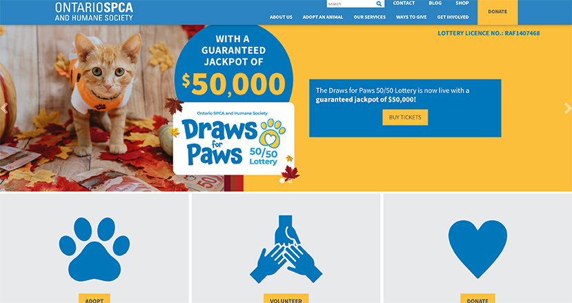
Nonprofit Website Overview
The Ontario SPCA and Humane Society works to improve the lives of in-need animals across the Ontario region.
Like other animal welfare organizations, the Ontario SPCA’s website has the benefit of being able to use tons of adorable pet photos. This is an extremely effective way to draw in readers. After getting supporters’ attention, though, this site goes even further to boost engagement with its mission.
Why This Website Stands Out
The Ontario SPCA website stands because it effectively engages readers through its design elements. These include:
- Local events calendar. As a region-specific organization, the site’s Events page is a great way to give readers a quick overview of new opportunities to get involved. Each event links to a dedicated page where readers can register.
- Embedded multimedia. Multimedia, especially a cute video about a cat finding a new home, is excellent for engaging readers, keeping them on the site longer and increasing the chance the organization will them to donate or volunteer.
- Extensive contact information. This site also features extensive contact options along its footer section, including links to follow their work on Facebook, X, Instagram, LinkedIn, and YouTube. This is a smart place to promote their social media profiles without cluttering the main body of the page.
Key Takeaway
If you want more engagement from your supporters, actively use your website to encourage it! Your homepage should be a rich resource for announcements, multimedia, and ways to get in touch with your team. The Ontario SPCA homepage is a great example of a comprehensive but still cleanly organized website.
11. Better Buying
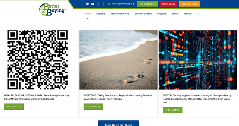
Nonprofit Website Overview
Better Buying is a nonprofit initiative aimed at creating a more equitable economic global environment by encouraging more responsible retail practices.
Its rating platform allows suppliers to anonymously rate the purchasing practices of various retailers. This simple concept has the ability to spark major change in global trade—rewarding socially-responsible players with increased visibility, increasing the likelihood that products will be sourced from firms that honor safe working conditions and generating new relationships for forward-looking companies of all sizes. The Better Buying website clearly and proudly proclaims this mission.
Why This Website Stands Out
Better Buying wanted a new site that was easy to manage and navigate. After all, handling plenty of web visitors without losing or confusing them is essential for a ratings index service! To that end, the Better Buying site has a few standout qualities:
- Clearly labeled navigation bar. The Better Buying homepage includes clear labels for only the most essential information that visitors need to know—what they do, their standards for responsible purchasing practices, and how to submit a rating.
- Simplified design. No unnecessary design elements get between Better Buying and its web visitors. Keeping it simple and straightforward is a great way to convey a professional attitude and strong principles of stewardship.
- Branding that matches the cause. The green and blue colors used throughout the Better Buying website bring to mind Earth and the environment. This branding is fitting for Better Buying’s focus on environmental sustainability.
Key Takeaway
Just like with the previous entry on our list, the Better Buying site shows us that simple visual design wins out, but that doesn’t mean it can’t be bold! Carefully chosen photos and thoughtful branding can be visually appealing ways to catch the eye without overwhelming readers.
12. Lupus Research Alliance
Nonprofit Website Overview
The Lupus Research Alliance is the world’s leading private funder of lupus research. Established in the merger of three separate nonprofits, the Alliance focuses equally on fundraising for research and spearheading advocacy efforts on behalf of the lupus community.
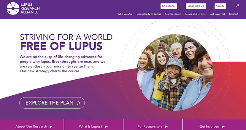
The Lupus Research Alliance’s website serves as an essential resource for its community. As a hub that connects patients, donors, researchers, and those simply wanting to learn more, the site has a few important roles to fill.
Why This Website Stands Out
A number of best practices make the Lupus Research Alliance site a top nonprofit website. These include:
- Consistent branding. The striking logo and colors of the Lupus Research Alliance stand out on every page of the site without distracting attention. This branding conveys visual authority to reassure visitors and donors.
- Strong content and media features. The site includes a highly engaging Educational Resources section, where the Alliance provides information about lupus and resources for those living with lupus. The site also features a Lupus Stories page that shares video stories of those affected by Lupus.
- Effective design throughout. All across the Lupus Research Alliance website, strong elements of design catch the reader’s attention, like bold infographics, eye-catching call-to-action buttons, and easy-to-use drop-down menus.
Key Takeaway
Your site should actively use its design features to keep readers engaged. Attractive infographics, consistent branding, well-organized content, and clear labels are all important, especially when your site needs to satisfy the needs of multiple audiences at once.
13. National Partnership for Women & Families
Nonprofit Website Overview
The nation’s leading advocacy organization for women and families, the National Partnership for Women & Families has addressed the unique and pressing political and social issues that face women and children in the United States since 1971.
Helping more people to understand the intersections of political, economic, and women’s rights issues (and how they relate to the broader health of American society) is a key part of the Partnership’s mission. This means that their website must serve as a useful hub for a wide variety of readers, including staff, researchers, resource visitors, donors, and advocates.
Why This Website Stands Out
A nonprofit’s website must actively contribute to its mission and goals. For the National Partnership for Women and Families, a number of important features clearly align its site with its goals and make it an invaluable tool. These include:
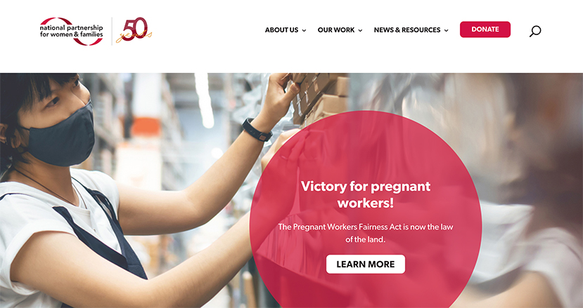
- Prominent donation buttons. Did you notice the donation button on the navigation bar on the homepage above? Making it simple and fast for donors to send even a small gift goes a long way to build support and reinforce your relationships.
- Clear organization. From the homepage to each additional page on the site, the National Partnership prioritizes organization and clarity. If you’re looking for information on a specific topic, issue, or campaign, you can navigate to it in just a few clicks.
- Emphasized calls to action. As an advocacy organization first and foremost, it’s essential that the National Partnership educates its website visitors about their initiatives and how they can get involved. The drop-down menu under “Our Work” allows visitors to explore several issues and platforms, from fair pay to reproductive rights.
Key Takeaway
Make it very clear what you want readers to do after engaging with your site. Remember that your nonprofit’s supporters are drawn to you because they’re drawn to your mission on a personal level, so don’t be shy about incorporating calls to action into your website!
14. American Cancer Society
Nonprofit Website Overview
The American Cancer Society (ACS) works to improve the lives of those with cancer and their families and to ensure that everyone has an opportunity to prevent, detect, treat, and survive cancer.
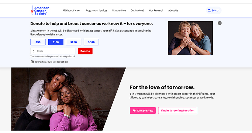
ACS is a massive organization with a far-reaching mission. Its website is built to support individuals whose lives have been affected by cancer in whatever way is needed, whether that be education about prevention or support for survivors. The ACS site keeps the visuals simple to emphasize the vital information it offers to the public.
Why This Website Stands Out
ACS has a clean, modern website design and is filled with useful information and tools to address every website visitor’s needs. Some of the standout elements of the site include:
- Educational content. The ACS site offers tons of educational resources for cancer education. Take the What Is Cancer? page as an example. It explains what cancer is, how it is caused, and how it spreads. Educational pages like these also don’t miss an opportunity to encourage action. As you scroll through educational articles, a small pop-up appears encouraging you to donate to ACS if you found the information helpful.
- Cancer Stories page. A cancer diagnosis is no easy thing to grapple with. ACS created a Cancer Stories page on its site where visitors can read and watch short stories of real individuals affected by cancer. This helps put a human face to ACS’s cause and cancer itself. The stories evoke feelings of hope and support that can help visitors feel less alone and inspired to get involved.
- Two distinct donation buttons. ACS understands its community of supporters and why and how they prefer to give. On its site, they offer two donation options in the form of prominent buttons—donate or give in honor and memorial. Both lead to distinct, easy-to-use donation forms.
Key Takeaway
ACS understands the gravity of its cause and impact. By prioritizing useful information and tools over visual design bells and whistles, ACS’s site keeps the focus on the people that cancer affects. Consider your cause and what your website says about it. Are there any adjustments you should make to ensure that your site reflects what you truly stand for and offer to your community?
15. iThrive Games
Nonprofit Website Overview
iThrive Games is a nonprofit devoted to developing educational games and resources to help teens reach their full potential. By leveraging technology and game design, iThrive’s games help students develop the social and emotional skills they need to confidently navigate today’s constantly changing world.
The organization offers a wide range of education resources, including simulation scenarios for civics classes, design thinking studio classes, complete game-based curricula, and research journals. With so much to offer, iThrive Games needed a website that could bring it all together, provide a strong user experience, and reinforce its brand and mission.
Why This Website Stands Out
iThrive Games’ site stands out for a few reasons, but particularly for its sleek design and easy-to-use navigation. Consider these elements:
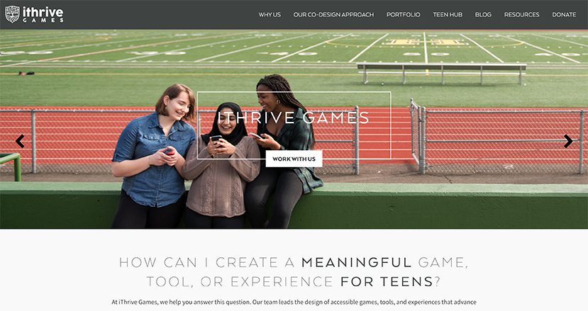
- Clear and unobtrusive navigation. A clearly labeled navigation bar directs visitors to the exact offerings they’re looking for. The visual design of the site’s navigation elements does its job well without distracting from the other visuals on each page.
- Strong use of photography. Photos of students engaging with iThrive programming anchor every page of its site. This emphasis on the actual impact of the organization’s work is extremely effective at reinforcing its mission no matter what brought you to their site.
- Engaging blog posts. iThrive Games boasts an active blog, an increasingly important way to engage supporters and constituents. Eye-catching graphic design helps draw more readers into the blog to connect with the organization’s resources and get involved.
Key Takeaway
The iThrive Games website is exceptionally coherent and focused. Every corner of the site tells the organization’s story with photos of real students and educators engaging with their programming. Coupled with other engagement-boosting elements, like eye-catching blog posts, this tight focus on mission creates an extremely smooth user experience that encourages repeat visits.
16. Tree House Humane Society
Nonprofit Website Overview
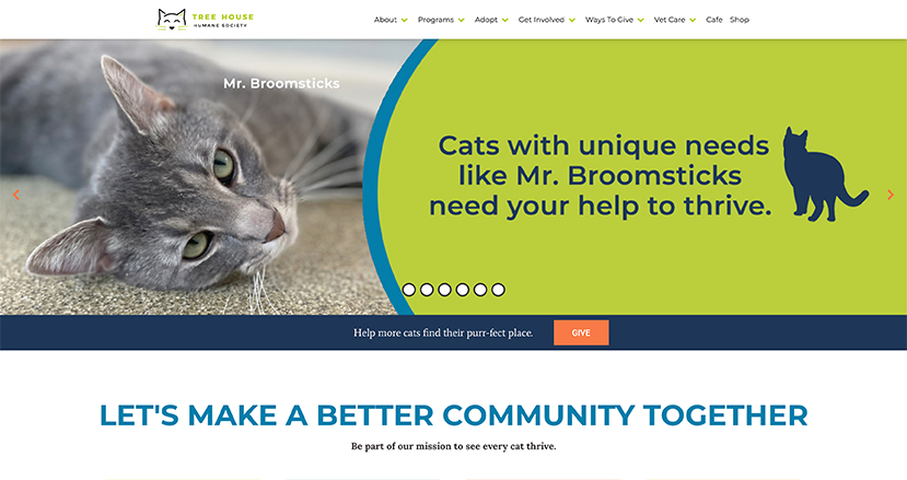
Tree House Humane Society is a Chicago-based organization devoted to providing lifesaving care and shelter to stray cats.
Amid the challenges of 2020, Tree House needed to ensure its website could pick up the slack left by the sudden infeasibility of in-person engagement. With extensive navigation tools directing readers to information on adoption, other ways to engage, ways to give, and more, visitors are immediately directed to whichever tool or resource they’ll need.
Tree House Humane’s site makes it easy to find exactly what you’re looking for, but it also follows even more web design best practices that are worth exploring.
Why This Website Stands Out
Tree House Humane’s site is an excellent model for other animal welfare and services organizations. Their website incorporates a number of integrated tools that improve the user experience, including:
- FAQ page. Tree House Humane Society has a great About Us page, but they also offer an FAQ page on their site. Users can get answers to their questions about the organization, the adoption process, cat intake, and general cat care.
- Extensive ways to give. A robust Ways to Give page is always a must-have for nonprofits. Tree House’s page includes details on various contribution methods, including integrated donation tools, sponsorship options, and information on tribute and planned gifts.
- Newsletter sign-up. The organization also makes it easy for users to sign up for their monthly newsletter with a sign-up tool on their homepage. Users only need to input their name and email to get on the mailing list.
Key Takeaway
To boost engagement on your site, you have to make it easy for visitors to engage with your message! The Tree House Humane Society’s website showcases a number of elements that all prioritize user experience. Creating dedicated pages for various ways supporters can engage makes it easy for the organization to direct visitors to exactly what they’re looking for.
17. Brooklyn Conservatory of Music
Nonprofit website overview
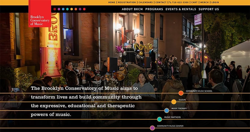
The Brooklyn Conservatory of Music works to transform lives and build community through the expressive, educational, and therapeutic powers of music.
Recently the Conservatory partnered with Team DNL to refresh its website. The result is a site that is aesthetically beautiful, useful for visitors, and full of easy-to-use tools that allow people to quickly get involved with the organization’s programs.
why this website stands out
The Brooklyn Conservatory of Music website shows how great design and smooth functionality can go hand in hand. Here are a few best practices we see in action on this site:
- Stand-out branding and imagery. The Conservatory’s brand colors are represented consistently across the website on headers, graphic icons, and buttons. This gives the site a professional, polished look. Plus, there are plenty of images of the organization in action, from kids playing instruments to staff members leading programs.
- Interactive features. The site features login portals, an email newsletter sign-up, and filtering tools to help visitors find the right class or program for them. One of our favorite features is the events calendar, where you can roll over an event and quickly see important details for attending.
- Organized navigation. The Conservatory offers a top-level navigation bar with important pages nested under each core category. This makes it easy for visitors to find their way around the website.
Key takeaway
When designing your own nonprofit website, remember that it is possible to have both a strong visual design and seamless functionality. In fact, both of these elements work together to provide a greater user experience for anyone who lands on your website and leave a lasting impression that will have them coming back and engaging again and again.
18. North Carolina Center for Nonprofits
nonprofit website overview
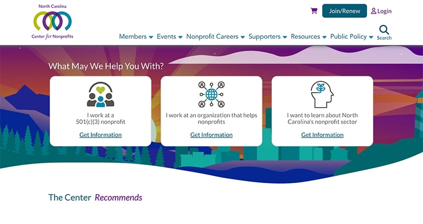
The North Carolina Center for Nonprofits is an organization that supports the nonprofit sector in the state of North Carolina. They maintain a strong statewide network of nonprofit leaders and partners, offer nonprofit resources, and advocate for and with nonprofit organizations.
While this nonprofit website does have a great visual look, its strengths lie in its robust functionality. After all, to run a successful community and distribute resources, the Center’s website needs to be a hub for information and tools that are easy to access and use.
why this website stands out
The North Carolina Center for Nonprofits website has a lot working behind the scenes to offer a powerful user experience. Here are some highlights of what the organization offers on its website:
- Search functionality: Sometimes website visitors know exactly what they’re looking for or have a certain focus area in mind. This website provides a search functionality that empowers visitors to search by keyword to find what they’re looking for. Even better, they can refine their search results by topic or resource type.
- Easy-to-use career section: Connecting nonprofit professionals with career opportunities is a priority for the Center. To help, they offer a tool for employers to post jobs and job seekers to browse those jobs. The tool makes it easy to see the scope of the job (full-time or part-time) and the salary range for the position.
- Thorough resource library: The North Carolina Center for Nonprofits knows that nonprofit professionals are constantly working to learn new best practices and strategies. They’ve created a resource library that offers everything from a nonprofit starter kit to compliance checklists and blog articles.
key takeaway
Your organization’s work will inform what your website needs to look like and what it needs to do for its visitors. Think through the tools and resources that your website visitors need to fully engage with your work, whether that be a regularly updated blog, a members-only portal, a mobile-optimized donation form, or an alumni directory.
Designing Your Own Nonprofit Website: Where to Start
Now that you’ve explored some of the best nonprofit sites on the web, it’s time to begin designing (or redesigning) your own! Here are some tips to help you get started:
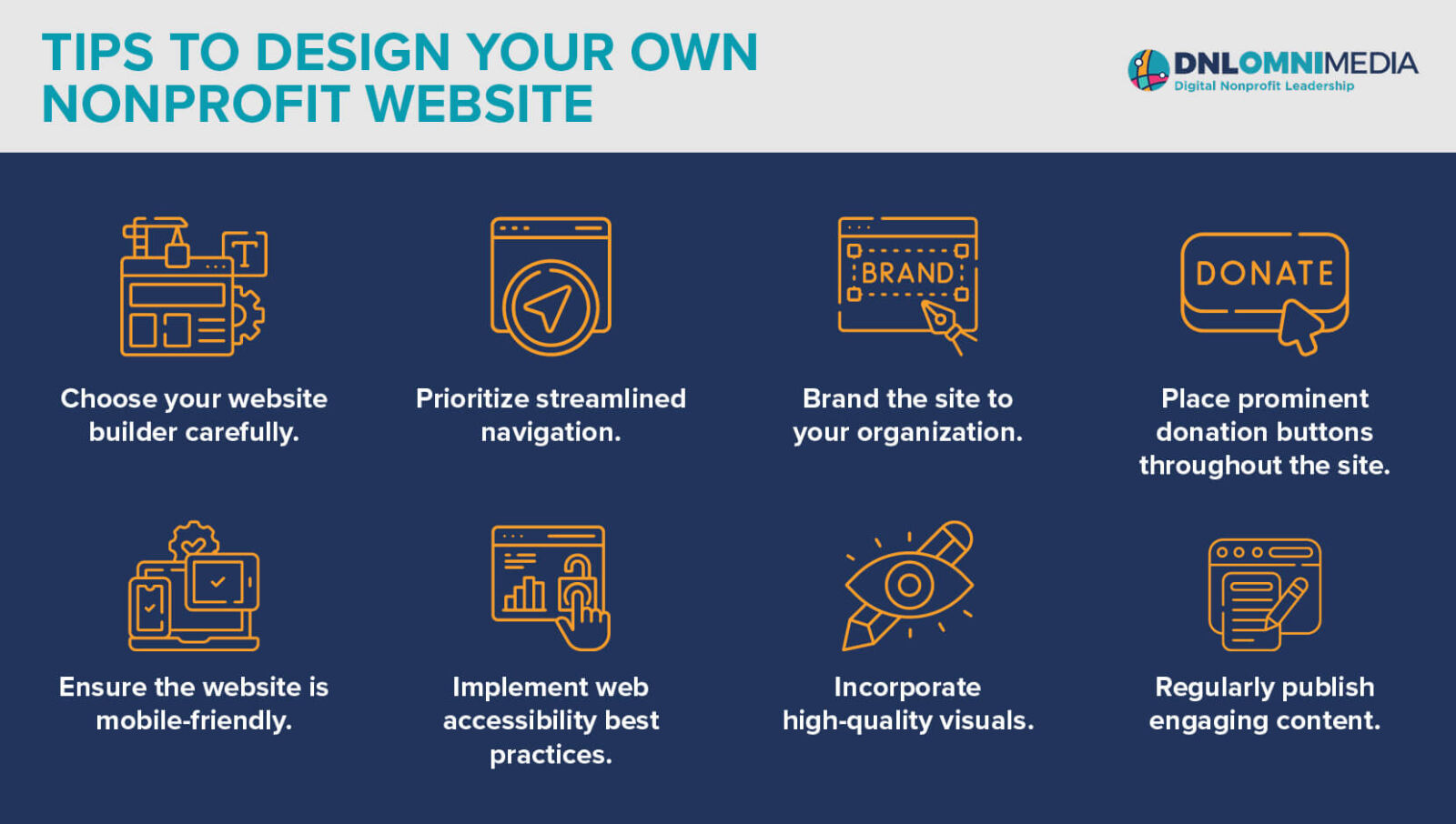
- Choose your website builder carefully. A website builder, also known as a content management system (CMS), is a tool that lets you create, organize, and arrange website content. Since it doesn’t rely on code, it makes designing a website much easier no matter your experience level. There are several platforms to choose from, including WordPress, Drupal, Squarespace, and HubSpot. When choosing your website builder, look for a tool that is user-friendly, scalable, and aligns with your budget.
- Prioritize streamlined navigation. When website visitors land on your site, they need to be able to quickly find what they’re looking for. Ensure that your navigation menu is prominent and links to the most important pages on your website, like your About Us page, Events page, donation page, and blog.
- Brand the site to your organization. Website visitors should associate your website with your organization as soon as they see it. Incorporate your visual brand into the site design, including your color scheme, typography, and logo. This will give your website a polished and professional look and assure visitors that your site is trustworthy and associated with your organization.
- Place prominent donation buttons throughout the site. Your website has the potential to be an excellent fundraising tool if you build it that way. Set your site up to generate donations by including call-to-action buttons throughout the site that direct visitors to your donation page. Your buttons should stand out visually from other elements on the page and have short, eye-catching text that convinces visitors to click through.
- Ensure the website is mobile-friendly. Research shows that 57% of nonprofit website traffic comes from mobile devices. Prepare to welcome traffic from smartphones and tablets by optimizing for mobile. Most website builders will automatically resize your content to fit whatever size screen your visitors are using, but you should always double-check to ensure the elements on each web page are working well on various devices.
- Implement web accessibility best practices. People of all abilities should be able to use your website and understand the content you offer there. Make sure your website is accessible by familiarizing yourself with and following the Web Content Accessibility Guidelines. For example, ensure adequate contrast between the text and background of each web page and provide alternative text for images so that screen reader users won’t miss out on information communicated visually.
- Incorporate high-quality visuals. Photos, graphics, and illustrations add character to your website and break up big walls of text. Select a visual style that aligns with your organization’s brand and use it consistently across your website. Additionally, include images of your team and volunteers at work or share photos of your beneficiaries to humanize your mission (with the subjects’ consent, of course).
- Regularly publish engaging content. Once your website is up and running, keep up with it by regularly publishing content and updating important pages. For example, ensure your Events page always accurately reflects your upcoming events schedule. You can also publish regular blog posts with updates about your work or specific projects.
Our #1 Tip for Creating the Nonprofit Website You Want: Work With Team DNL
Designing a website, especially a website that accurately reflects your mission and will help you accomplish your marketing and online fundraising goals, can be a challenge for busy nonprofits.
This is why we recommend handing over the heavy lifting to the experts at DNL OmniMedia!
Team DNL has helped dozens of nonprofits design beautiful and impactful websites that support the work they do every day, and we can help your organization do the same. Our nonprofit web development services include:
- Nonprofit website architecture and design
- Programming and development
- Content migration
- Quality assurance testing
- Nonprofit website maintenance
Our expertise doesn’t stop at web design, either! You can also work with our team to optimize your larger digital strategy, implement new technology solutions, and build custom integrations between your tools.
Your nonprofit’s website is central to your organization’s online presence. Draw inspiration from the incredible websites on this page to design or revamp your own website, and remember that Team DNL is ready to help you reach your website goals!
To continue learning about nonprofit websites and technology, check out these additional sources:
- Salesforce Nonprofit Cloud: Complete Rundown for Nonprofits
- Raiser’s Edge NXT: A Complete Overview for Nonprofits
- Navigating Nonprofit Data Warehouses: A Comprehensive Guide
