


Your nonprofit’s website is one of your most important assets, as it’s a cornerstone of your marketing strategy and often serves as the first touchpoint for potential supporters. The last thing you want to do is exclude new visitors from engaging with your mission online.
Increasingly, nonprofits are focusing on accessibility to ensure that all individuals can access their websites, no matter their abilities or situational limitations. Avoiding simple design mistakes and ensuring regulatory compliance should be a priority for any organization.
However, nonprofit website accessibility can be a tricky topic to understand. To help you get started, we’ve organized a complete overview. Here’s what we’ll cover:
- Nonprofit ADA Compliance and Website Accessibility: FAQs
- Benefits of Full Nonprofit Website Accessibility
- Nonprofit Website Accessibility Design Elements
- Common Nonprofit Web Accessibility Mistakes
- Testing for Nonprofit Website Accessibility
- How to Improve Your Website’s Accessibility and Usability
One of our specialties is nonprofit web design. We’ve helped many organizations improve their sites, and we’re available to assist your nonprofit as well. As you explore the details of website accessibility, don’t hesitate to reach out to work with us to apply these concepts to your website.
Nonprofit ADA Compliance and Website Accessibility: FAQs
Are Nonprofits Required to Comply with the Americans with Disabilities Act?
Yes, generally speaking.
The Americans with Disabilities Act (ADA) protects individuals with disabilities from facing discrimination in public life. It applies to any organization with 15 or more employees and any “public accommodations,” meaning services or facilities that are open to the general public. These broad characteristics apply to many types and sizes of nonprofits.
Even if a nonprofit is not covered by either of these guidelines, ADA compliance is still highly encouraged. It is never a bad idea to make the effort to include all potential supporters in your organization.
Are Websites Considered Public Accommodations?
The answer to this question has been hotly debated among federal and state courts, making it unclear what the rules are for nonprofits. The relevant ADA title, Title III, prohibits discrimination on the basis of disability in places of public accommodations. Certain courts maintain that Title III applies only to physical structures, whereas other courts assert that the language surrounding Title III is open to interpretation and may apply to websites.
In recent years, there have been clear shifts toward including websites as public accommodations that are subject to ADA regulation. For instance, in April 2024, the Federal Register published the Department of Justice’s (DOJ) final rule updating regulations for Title II of the ADA, outlining specific requirements for web and mobile app accessibility for state and local government websites. And, in February 2025, a Minnesota federal judge ruled that websites qualify as places of public accommodation under ADA Title III.
This indicates that there’s a growing legal understanding of websites as public accommodations. Therefore, courts can require websites to comply with accessibility guidelines if charged with violating the ADA.
What are the Web Content Accessibility Guidelines?
The Web Content Accessibility Guidelines (WCAG) are a set of comprehensive web usability standards developed by the World Wide Web Consortium (W3C). They define the best ways to ensure complete accessibility on any website, for users of all abilities and circumstances.
You don’t have to dig into the specifics of the WCAG just yet, but it’s important to note that these guidelines are used to determine ADA compliance. The WCAG defines three levels of accessibility success: A, AA, and AAA. To comply with the ADA, your website should at least achieve level AA.
Do Nonprofit Websites Need to Be ADA Compliant?
As of mid-2025, nonprofit organizations’ websites are not required to completely comply with the WCAG at the federal level. While public agencies have a clear, enforceable standard under Title II and the DOJ ruling mentioned above, private nonprofits have mixed court rulings and no federal consensus.
However, it’s highly encouraged that your nonprofit’s website is as compliant and accessible as possible to engage more potential supporters and prevent future ADA violations. Recent cases have established that ADA-covered organizations (like most nonprofits) can be required to comply if charges are ever filed.
Benefits of Full Nonprofit Website Accessibility
The single biggest benefit of creating a compliant website is that accessibility and usability go hand in hand. Accessible sites are typically much easier to read on any screen and under most conditions, such as when one has limited internet access. Users can also easily navigate accessible sites without a mouse, allowing them to move through the site quickly.
Consider the full range of benefits of web accessibility:
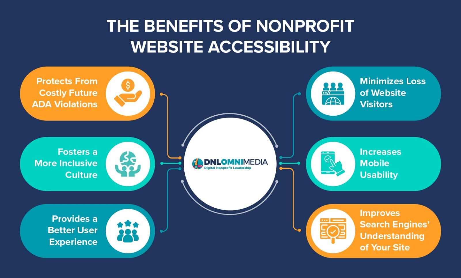
- Protects you from costly ADA violations down the line
- Fosters a more inclusive culture at your nonprofit
- Provides a friendlier and more pleasant user experience
- Minimizes the loss of website visitors
- Increases mobile usability
- Improves search engines’ ability to read and understand your site’s content, which may result in improved ranking
All of these elements can drive online engagement and donation revenue for your organization over time. Your nonprofit would never want to turn away new potential supporters, so taking the time to ensure your site and online tools are accessible and easy to use is a worthwhile investment.
Your web accessibility efforts should inform future decisions as well as current ones. For example, if you move to a new CMS platform or hire a web designer to complete a project on your website, you’ll want to make sure that those additions meet accessibility standards.
Nonprofit Website Accessibility Design Elements
The W3C outlines four core principles of accessible website design:

- Perceivable information and user interface (UI): Your website’s content should be perceivable by anyone using it, regardless of their abilities or circumstances. Providing text alternatives for non-text elements (like alt text for images and transcripts for videos) is a basic example.
- Operable UI and navigation: Users should be able to easily navigate and use your nonprofit’s website with a mouse, trackpad, or keyboard. When using a keyboard, the focus should not get lost or trapped anywhere in a page’s content.
- Understandable information and UI: The website’s content needs to make sense and be organized cleanly and logically. This is for the benefit of all users, especially those using text-to-speech devices.
- Robust content and reliable interpretation: Your nonprofit’s website’s code should have a clear structure to ensure that a variety of browsers, assistive devices, and other tools can reliably process it.
Each of these core principles can be broken down into more specific technical elements. Here are a few of the most important:
- Non-text content needs a text alternative, like transcripts and alt-text, that can be read or displayed.
- No content or instructions should rely solely on sensory characteristics, like color, shape, or location.
- Users should be able to stop or control the volume of any audio or video that plays automatically.
- Pages should generally never contain flashing elements.
- Clear page titles should be provided, and entry fields should always include labels or instructions.
- The focus order of the content should be discernible, meaning that important links and form elements need to be in logical order, and the tab order should not be reset manually.
Most modern websites already follow these best practices, as website-building tools increasingly account for these guidelines and make it fairly easy to ensure that your content complies by default.
However, there are a few more tech-heavy guidelines that may require the help of a web developer, including:
- Content should be completely navigable using a keyboard.
- Text needs a contrast ratio of at least 4.5:1 to ensure optimum visibility.
- Users should also be able to resize text up to 200%.
- If a user makes an input error, the site should describe the error in text.
- Changing any UI settings shouldn’t cause a change of context, that is, suddenly break the site or make it un-navigable.
- Content should be built in cleanly tagged and organized markup code that can be read by most browsers and assistive devices. Simple HTML is the best choice for most websites.
If your team isn’t particularly tech-savvy, these guidelines will likely require outside help. In many cases, you can customize your content management system (CMS) or website builder to ensure new content is automatically compliant. However, older websites or sites that run on older software may require more extensive work or upgrades.
Common Nonprofit Web Accessibility Mistakes
These are a few of the most common web accessibility design mistakes on nonprofit websites:
Poor Visual Design or Jumbled Elements
A visually messy website makes it difficult for users to quickly identify the purpose of a page and locate the information they want. Jumbled pages are irritating, serve a bad user experience, and drive away many users, harming your nonprofit’s digital strategy. Always aim for a streamlined, uncluttered design that focuses on each page’s main purpose.
Poor design can become a direct accessibility issue, as well. For instance, low-contrast color palettes can make it extremely difficult or impossible for low-vision or colorblind users to distinguish between different elements. Here’s a basic example of why this element is so important:
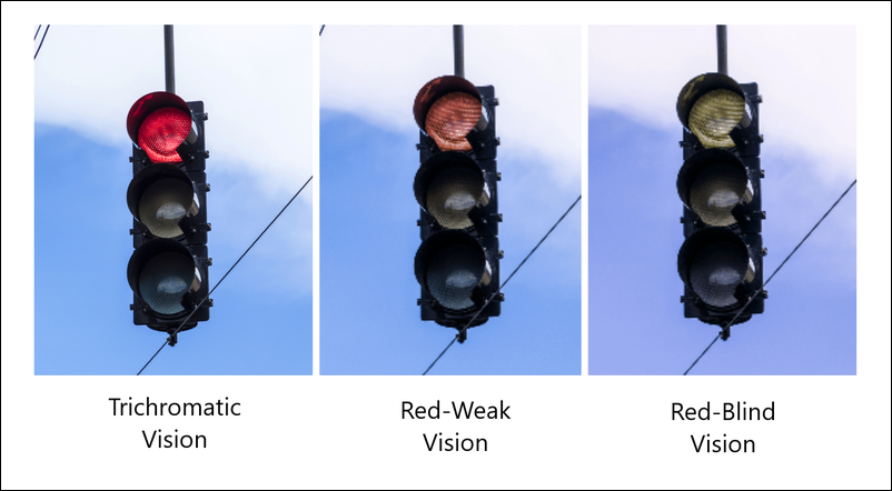
The appearance of the red stoplight image above varies greatly based on a user’s ability to perceive red light, and this photo has a decent color contrast level. Low-contrast color palettes significantly amplify this effect, making it difficult for most users to distinguish. Avoid using low-contrast images or text colors whenever possible.
Another consideration involves blue light filtering. As blue light filter plugins and tools become increasingly popular with a wide range of users, remember that filter tools can negatively alter the appearance of your site. Test your site to confirm that blue light filters don’t render your visual elements unreadable.
Unclear or Disorganized Text Structures
The text content of your pages should also be clear and well-organized. The main content of each page should have an obvious structure with one title, which should be rendered using heading 1 or the < h1 > HTML tag. Subsequent subtitles, if present, should be rendered in a logical order using headings 2, 3, 4 (< h2 >, < h3 >, < h4 > HTML tags).
The main idea is that headlines should serve as an outline for the page, allowing users to understand and navigate the logical structure intuitively. The headline order should always be clear, and the content within the headlines should not jump around between concepts in a confusing way.
The underlying text structure of your website’s pages can also seriously hinder visitors using screen reader devices. A screen reader will read all of the content on a page, and your website almost certainly includes a navigation bar at the top of each page. If you don’t provide effective skip links, you’ll inadvertently force those using screen readers to listen to the entirety of your navigation options on each page they visit. This will frustrate them and most likely cause them to abandon your site completely.
Lack of Text Alternatives to Non-Text Media and Decoration Clutter
This mistake is fairly common but probably the easiest to fix. Without providing text alternatives to the non-text media on your site’s page, you can accidentally make entire sections of your site inaccessible to visitors using screen readers. Or, if your site includes alternative text (alt text) for purely decorative images, the experience of reading the content with a screen reader may be very jarring and confusing.
Here are the general guidelines for improvement:
- Videos or audio files should have clearly labeled and linked transcriptions for easy access.
- Images that are used for decorative purposes should be hidden from screen readers.
- Images that provide meaningful information to all users should provide descriptive alt text or a caption.
Here’s an example of what it looks like to add alt-text to an image on the backend of our own CMS platform:
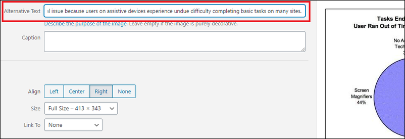
Visual-only or audio-only content should never be the only way for users to learn or access information on your pages. For example, large, detailed infographics are extremely useful for some users but useless for those with low or no vision. Adding a textual description of what the graphic conveys is essential for providing value to those visitors.
Nonintuitive or Missing Navigation
Users need ways to navigate directly to the content they want and quickly jump between pages as needed. Without clearly labeled and intuitive navigation menus, users will not be able to find what they need.
Keep your navigation titles concise, using one to three words. Make sure they accurately describe the landing page. Users will be less likely to engage with your website for long if they can’t easily find your donation page, calendar, newsletter, or the content they want to access.
Remember, very few users are visiting your website just to browse. In almost all cases, they want to accomplish a specific task. Without navigation that’s clearly labeled and easily accessible, you give them little reason to stay engaged with your website.
Inaccessible Form Elements
Websites that collect any type of user data, like email addresses, payment information, or login credentials, rely on web forms to process the data that users provide. Your nonprofit’s website almost certainly uses forms to collect online donations, allow members to log in, or facilitate newsletter or volunteer sign-ups.
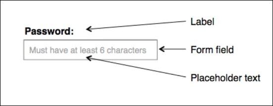
Each element of your forms, including labels, fields, and placeholders, needs to be properly configured for accessibility. Here’s an example diagram of what these elements are:
However, improperly configured web forms can pose significant accessibility challenges for some users. There are a few very common issues to avoid:
- Disappearing placeholder text: Input placeholder text like “Enter Password Here” displayed in an empty field reminds users what information goes there. However, it should never be the only way to describe the field, as the placeholder text will disappear once a user begins entering information into the field.
- Missing labels: Screen readers will only read visible text in the form, so they may not read placeholders within an input field. If the field has no labels, the user who is reading the form will not know what data they need to input into each field.
- Unmarked required fields: If a field is required in order to complete the task that the user is trying to accomplish, it should be clearly marked as required. This is typically done with a red asterisk or another signifier that can also be identified using a screen reader.
For more information about accessible form design, check out this overview from W3C.
Testing for Nonprofit Website Accessibility
To see how your own website stacks up in terms of accessibility, there are a few tools you can use to audit your site’s pages. These tools will read and analyze your site’s code to identify potential errors or missed opportunities.
Here are a few easy resources you can use to conduct audits of pages on your site:

- The World Wide Web Consortium’s HTML Validation Tool: This tool will check if your website has correct and valid HTML code. If your site does not have a valid code, it may not appear the same to all users, which typically causes problems for users who use assistive technologies.
- The WAVE browser extension: This browser plugin for Google Chrome, Firefox, and Microsoft Edge allows you to easily conduct accessibility audits. It runs a comprehensive scan on each page and identifies all possible accessibility issues, including contrast, code, content structure, links, and form elements. For each identified issue, the tool clearly states the problem and provides pertinent references on how to remedy the problem.
- Google’s Lighthouse audit tool: If you use Google Chrome as your web browser, you can use this built-in tool to quickly analyze any page’s backend code. Lighthouse checks for most accessibility compliance rules that can be automatically detected.
However, if your team isn’t tech-savvy or lacks experience in web development, the results from any of these methods or resources might not be immediately useful for you. In this case, partnering with a nonprofit web developer or tech consultant may be your best course of action. These experts will audit your website and translate their findings into actionable next steps. Or, they may even handle adjustments and changes for you!
How to Improve Your Website’s Accessibility and Usability
Let’s walk through the specific steps you can take on your own or with a web design partner in order to improve your nonprofit’s website:
Steps to Take on Your Own
There are a number of simple steps that your own team can take to improve the accessibility and usability of your nonprofit’s website. Consider these easy fixes to the common mistakes listed above:

- Clean up visual design. Focus on streamlining your content and minimizing the number of visual elements on each page. Additionally, audit tools can check the contrast ratio between the colors of your site’s text and background. For standalone graphics or images, always avoid low contrast or washed-out colors.
- Create organized text structures. Use clear heading structures for the main text of your site’s pages, and keep code as tidy as possible. Provide effective skip links for those using screen reader devices.
- Provide text alternatives. Whenever possible, add alt-text, captions, and transcriptions for non-text media, such as images and videos.
- Hide decorative images from screen readers. Identify images that serve only decorative purposes. Update your website’s code to hide those images from screen readers.
- Establish intuitive navigation. Add useful navigation links to the top or side of each page of your site to ensure visitors can always find where they need to go.
- Optimize your forms. Provide text labels on your forms outside of the fields themselves, avoiding placeholder text. Clearly designate any required fields. Remove tab order attributes if any are present on the forms.
Best practices like these should be part of your team’s standard approach to creating or updating content on your organization’s website. Familiarize them with the core principles of accessible design.
Steps to Take with a Partner
In many cases, working with a professional nonprofit web developer or technology consultant is smarter than handling website accessibility alone. A tech expert can handle the deeper and more structural updates that your website may need to reach full ADA and WCAG compliance.
If you’re unsure of your website’s current state in terms of accessibility, a tech consultant can definitely help by conducting a complete test or audit. Other common ways that a partner can strengthen your compliance include:
- Develop and implement solutions to make your site more adjustable by users, including text size, color contrasts, and the ability to stop or hide any moving design elements.
- Ensure that your entire site is keyboard navigable and cleanly structured so that it can be easily read via a screen reader device.
- Manage more comprehensive upgrade projects to refresh your website’s design, clean up the code, and update the tools so that the newly rendered content adheres to accessibility standards.
If you’re interested in working with a tech partner, don’t hesitate to contact Team DNL! We’ve got decades of experience helping nonprofits build and design appealing and accessible websites that accelerate their missions.
Additional Resources
While most modern websites are already fairly accessible, this is still a concern for many nonprofits. With websites more frequently falling under the ADA’s classification of “public accommodations,” it’s best to avoid noncompliance. A more compliant website is simply a better, more usable website that allows all users to learn more about the organization, regardless of ability and circumstances.
Want to learn more about nonprofit websites? Check out these additional resources:
- Nonprofit Website Design: An In-Depth Look at the Process. Explore how to design a high-quality, accessible website that raises awareness for your cause, secures support, and drives your mission forward.
- 15+ Top Nonprofit Websites: Get Inspired & Design Your Own! Not sure how to handle your website design? Check out these examples of top nonprofit websites for inspiration.
- Nonprofit Consulting Firms: 25+ Top Options To Choose From. Nonprofits often benefit from working with outside experts on everything from fundraising to website design to grant management. Discover the top consulting firms in this guide.